Stories
Branch designer replacing teller lines with collaborative spaces

First-ever interior designer for U.S. Bank branches works to bring relationship-focused experiences to customers
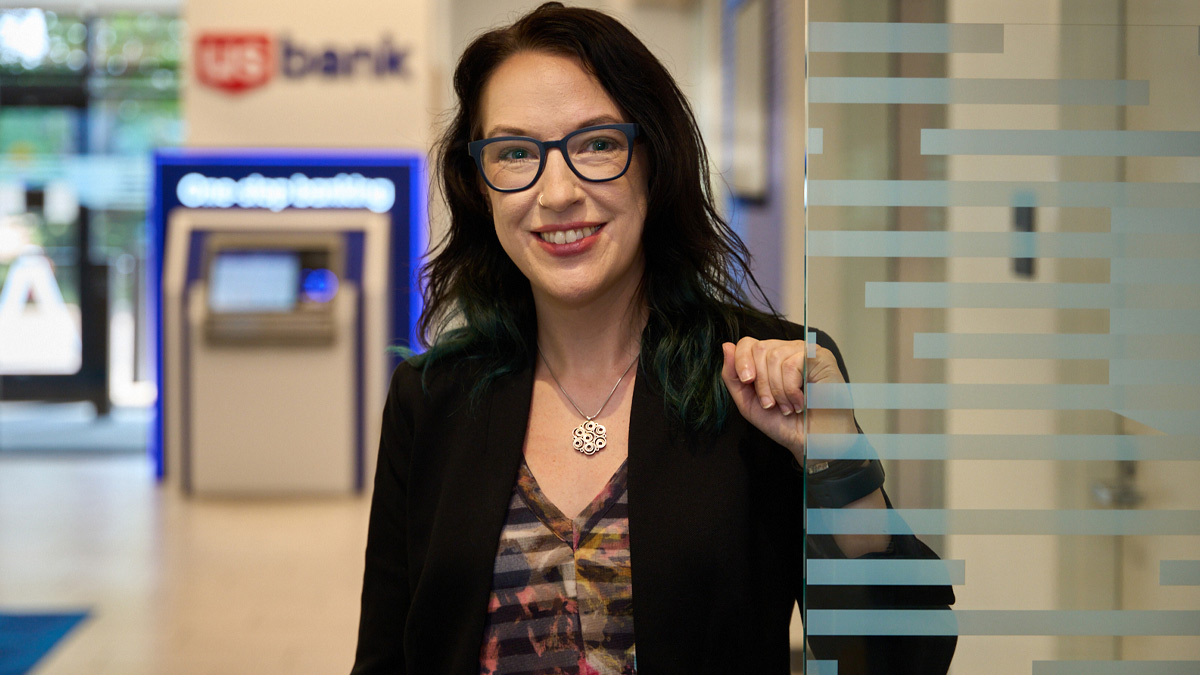
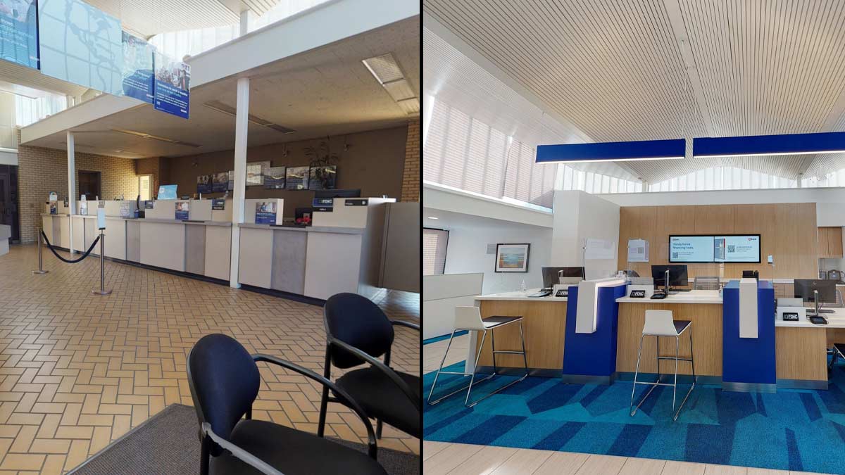
If someone visited a remodeled or newly built U.S. Bank branch, they’d be greeted at the door by a banker and might wonder where the teller lines are. The updated approach to banking is something Amy Paul is working to bring to branches from coast to coast.
“We’re updating the design of the branches to support how people are now banking,” said Paul, the bank’s retail design manager, a position that was created when she joined the company four years ago.
“Five or 10 years ago, most people came to the branch to cash a check. It was all very transactional,” Paul said. "With so many digital ways to do that now, we're focused on building a space that is more open and inviting, and that offers more of an opportunity for our employees and customers to dive deeper on their needs and where they want to go financially."
When Paul works on updating a branch, she studies customer transaction data and anecdotal feedback to understand the branch’s needs.
“We use that to determine how many offices we have for bankers to meet with customers, how many ATMs, how many customer support stations and so forth,” she said.

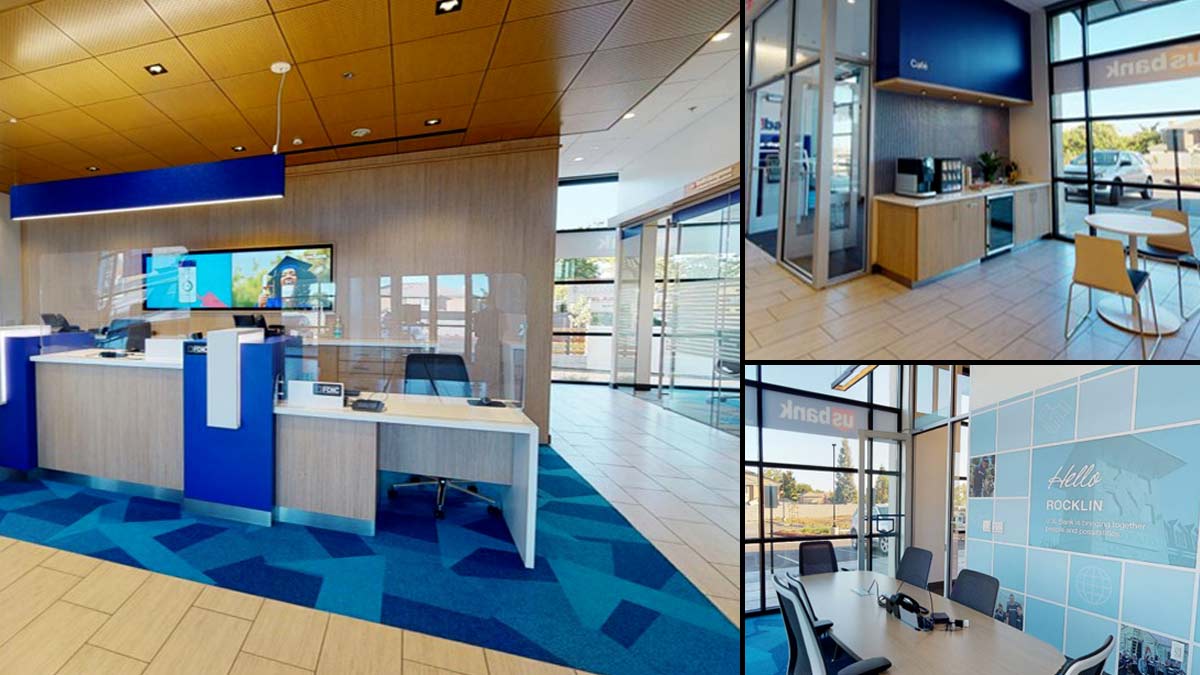
Branches being built today have fewer teller stations than in the past and instead have more spaces for bankers to meet privately with customers.
It's a trend seen across the industry, yet U.S. Bank offers unique twists to that design, Paul said. For example, some U.S. Bank branches have community rooms with kitchenettes and restrooms that customers can use outside of branch hours.
“Customers can have board meetings or small business meetings there,” Paul said. “While we’ve always been community-focused, the addition of this space gives our communities a place to meet as well as gives our bankers somewhere to hold financial education seminars.”

Since joining the bank, Paul has developed a playbook of design standards to be incorporated into branches. Depending on needs and priorities, branches are given anything from a minor update to a complete remodel.
The design standards align with the U.S. Bank branding and focus on digital banking services such as its highly rated mobile banking app.
“We’re trying to align the look and feel of our physical spaces with the look and feel of our digital spaces,” Paul said. “We’re using the same color scheme and same general feeling in branches, the mobile banking app and our website.”
While the goal is for customers to know as soon as they walk in that a branch is a U.S. Bank branch, the bank is not taking a cookie-cutter approach, she said.
“When there are elements that are important to a specific community, we work to incorporate them,” Paul said. “When we remodeled the branch in Minneapolis near where Prince lived, there was a painting of him that had been created during a special event. The branch team wanted to keep it, so we made sure we gave that piece of art a good place as part of the remodel.”
More stories
Media center
Press contact information, latest news and more
Learn more
Company facts, history, leadership and more
Work for U.S. Bank
Explore job opportunities based on your skills and location
